 -10%
-10%
Description
Diamond Pro – Premium Responsive Sngine Theme
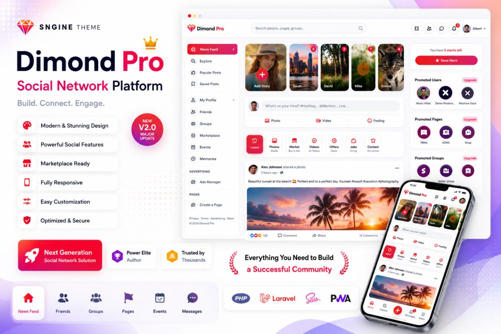
Diamond Pro is a modern, high-performance, and visually stunning premium theme meticulously crafted for the Sngine PHP script. Designed to completely overhaul the default look of your platform, Diamond Pro injects a vibrant, clean, and ultra-professional aesthetic that keeps users engaged and enhances your community's overall experience.
Every single page has been carefully redesigned, replacing the standard layout with a polished interface featuring a gorgeous new color scheme, customized background dynamics, and fully modernized icon sets.
🌟 Key Features & Enhancements
Completely Revamped UI & UX: A total visual transformation from the default Sngine layout. Features a beautiful dark/light-balanced color palette, premium background styling, and streamlined padding for maximum readability.
Enhanced "What's On Your Mind?" Publisher: Re-engineered with an incredibly smooth interface, custom icon highlights, and a cleaner input structure that makes posting feel natural and engaging.
Advanced "Add Story" Interface: A massive upgrade over the default theme. Includes a beautifully redesigned creator modal with vibrant built-in color background options, giving your users full creative freedom when sharing their moments.
Next-Gen Marketplace Experience: The marketplace has been completely redesigned with an elegant grid layout, enhanced badge alerts (like the "New" tag), and clean product cards.
Premium Single Product View: When users click inside a marketplace listing, they are greeted by a luxury, organized layout featuring larger image galleries, beautifully segmented meta-data, and prominent, high-converting call-to-action buttons (Message Seller & Buy Now).
Custom Global Navigation & Header: Includes extra breathing room and refined top-bar elements, making platform exploration significantly easier and faster than the default theme.
100% Mobile Responsive: Tailored to perfection to look flawlessly sharp on laptops, tablets, and smartphones alike.
Every Page Customized: From the News Feed and Profiles to Pages, Groups, and Settings—no default page was left untouched.
🛠️ Compatibility & Requirements
Core Script: Requires the Sngine PHP Script (Latest Version Compatible).
Easy Installation: Upload, switch your theme in the admin panel, and you are ready to go!
Clean Code: Built following Sngine’s best practices to ensure fast page load speeds and seamless server-side performance.
📦 What's Included in the Pack?
Theme Files (CSS, JS, and PHP Templates)
Step-by-Step Documentation Guide
Live demo : hi24.co.uk
username : demo
Password : demo1234
( or you can register as new user )
Updates
***********************************
v2.0 — What's New (27/08/2026)
- Mobile messages: the send button now works. It previously did nothing at all — the chat script disables the Enter key on phones and the button had no handler of its own, so there was no way to send a message.
- Mobile messages: the send button sits next to the message box on the same line, with a rounded input, instead of being stranded on its own line below it.
- Mobile messages: the conversation list no longer opens on top of the message box, so a tap meant for the composer lands on the composer.
- Mobile messages: the bottom navigation bar no longer covers the composer.
- Apple and Discord sign-in are now offered on the sign-in and register screens, in the same icon style as the other providers — each shown only when you enable it in the admin panel.
- Eleven missing icons added for the payment and captcha settings — Apple, Discord, Bancontact, BLIK, Cash App, CCBill, EPS, hCaptcha, iDEAL, OXXO and Przelewy24. Those rows used to render as blank space.
- The floating online-friends strip on the right edge is hidden, and the 75px of page padding Sngine reserved for it is released, so the three columns sit centred instead of pushed to one side.
- The left menu is narrower — 288px instead of 362px — still wide enough for the longest label, and the space goes back to the feed so the gaps on both sides come out even.
- Reels: comments open as a bottom sheet with a clear X to close them, instead of covering the whole screen with no obvious way out.
- Reels: the like, comment and share icons are larger and easier to hit, with a lighter circle around each glyph.
- Mobile settings page: the left-hand menu no longer runs underneath the bottom navigation bar — it scrolls inside its own space.
- Mobile profile page: photo search and the other desktop-only controls are hidden on your own profile.
- The feed tab strip now responds to a finger — drag and swipe, not just the arrows.
- Offer and promotion images are capped so one image can no longer take over the screen, on desktop as well as mobile.
- Chat list: the ONLINE / OFFLINE word beside each name is replaced by a larger, ringed status dot — the same information without eating the width the name needs.
- The reactions popup stays on screen instead of running off the edge.
- The "yay" face stays inside its card. An idle animation was looping on the image and scaling it past the card's bounds; hovering still enlarges it as before.
- Theme stylesheets carry a new version tag, so visitors pick up this release immediately rather than a cached copy of the old one.
- After updating, clear
content/cache/and hard-refresh (Ctrl+F5 / Cmd+Shift+R) — Sngine compiles theme templates, so otherwise the old pages keep being served. - Licensing is untouched: the
DiamondPro_Licensefolder is byte-for-byte identical to the previous release, so existing activations carry over and nothing needs re-activating.
***********************************
v1.01 — What's New (25/08/2026)
- Messages page fixed: clicking the message box opened the photo picker instead of letting you type. The hidden upload field was stretching across the whole input area and sitting on top of the text box. You can now click and type normally.
- Attach photo button fixed: the photo icon on the messages page did nothing when clicked. It now opens the file picker as expected.
- Send button fixed: on desktop the send button did nothing — messages could only be sent by pressing Enter. Clicking send now works everywhere.
- Photos can now be sent on their own, without having to type a message alongside them.
- "Typing…" fixed: the typing indicator was showing permanently on every conversation, whether or not anyone was typing. It now appears only while the other person is typing.
- Message alignment fixed: your own messages now sit on the right and the other person's on the left — including messages you have just sent, which previously appeared in the middle of the conversation until the page was refreshed.
- Newly sent messages no longer appear squashed into a narrow bubble with the text broken across several lines.
- Chatbox messages fixed: in the group and event chatboxes, messages appeared blank — white text on a white background. They now use the same colours as the main messages page.
- Search added to the chat list: a search box now sits between the "Chats" title and the new message button, filtering your conversations by name or by the last message. It clears with the X button or the Escape key.
- Album "Add Photos" fixed: the Upload Photos, Feelings/Activity and Check In options were missing from the add-photos window, making it impossible to add photos to an album. They are back.
- Login and register pages: the logo is now centred on all screen sizes, not just on phones.
*************************************
v0.9 — What's New (23/08/2026)
- Arabic / RTL fixed: the right-to-left stylesheets are now generated from the current theme design, so switching to Arabic shows the same modern layout, properly mirrored — no more broken pages.
- Left side menu now stays on screen while you scroll, fills the height of the window, and scrolls inside without a visible scrollbar.
- Left side menu icons now use the red tile style everywhere; hovering turns the tile white with a dark icon so you can see what you're pointing at.
- Wider layout: the page now uses the full width of large screens, with tighter column spacing so the middle feed gets more room; the floating chat strip on the right edge is removed.
- Tighter, cleaner spacing: 5px between the top cards and 8px between posts and right-side widgets — no more big empty gaps between boxes.
- Feed filter tabs redesigned: rounded corners that match the other cards, smaller tabs, and working left/right arrows that appear only when there is somewhere to scroll.
- "Meet New People" box tidied up: slim rows with thin dividers and Add buttons that all line up in one neat column.
- Chat dropdown fixed: a message containing an emoji no longer breaks the header icons onto a second row.
- Offers and Jobs pages behave on phones: images are capped to a sensible height and can never push the page wider than the screen.
- Login and register pages now show the logo centred on mobile.
- Reels: the volume button moved from the bottom bar to the left side, in a round button under the up/down arrows.
- New protection layer: right-click, image dragging, F12 and the common view-source shortcuts are disabled for visitors (the admin panel is not affected).
- Faster updates for your visitors: theme CSS now carries a version tag so everyone gets the new design immediately instead of a cached old one.
*************************************
v1.1 — What's New (17/08/2026)
- Left side menu now stays fixed on screen while you scroll, so your navigation is always in reach.
- Left side menu is now shorter and cleaner — it shows News Feed, Mine, Saved, Scheduled, Memories and your active plugins, with everything else tucked under "Show more".
- Left side menu has a fresh, modern look: new icon tiles, smoother hover and active states, and full dark mode support.
- Fixed: "My Offers" and "My Jobs" in the side menu opened a 404 error page. Both now open correctly.
- Fixed: the "Mine" menu group no longer stays closed and unhighlighted when you are on one of its pages.
- The "Offers" and "Jobs" shortcuts now open the full listings, so browsing and managing your own are kept separate.
- Opening a single post no longer stretches across the whole page. It now uses the normal post width with a new side panel showing the author, post details and quick links.
- Removed the small grey "Popular" / "Suggested for you" label that appeared above almost every post in the news feed.
- Cleaner spacing between posts in the news feed, so each post reads as its own card.
- Right-click, F12 and the developer-tool and view-source shortcuts are now blocked for visitors, to discourage casual copying of the theme. Admins and moderators are unaffected, so you can still inspect your own site.
************************************
v1.0 — What's New (16/08/2026)
- Automatic license has been added. There is no need to contact us for approval
- Multi-platform support
- Clean admin panel
- Full documentation
- Lifetime updates
the best sngine theme so far in the market, my website looks stunning with this theme and storyboost plugin
This theme is something miracle , Love it its perfect
hi, it's very nice and simple to install. i want to know if i can change the red color into Blue color for the all template.
This theme is just so Cool. functionality is mwah. One of the best theme for sngine. So amazing!
why dark mode have some issue?
HI sorry just seen it your message , What issue do u seee it ?